Unlock Massive Revenue Gains

Calculate your ROI
Identify leaks in your revenue

Digital infographic showing performance metrics, including a practice level graph, a performance score gauge, a trend line graph, and a category rating of B+.

Experience Your Data Made Simple
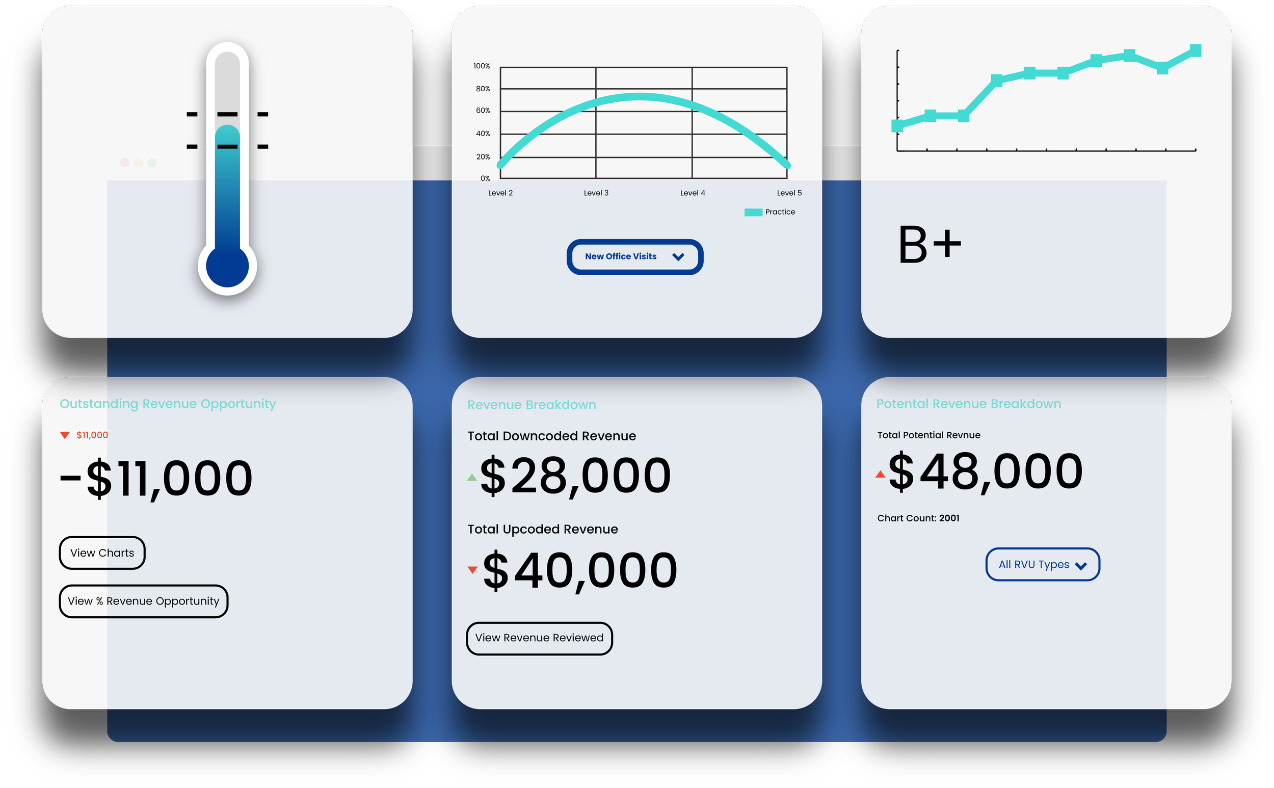
Digital screen displaying a negative revenue change of $11,000 in red, with the title 'Outstanding Revenue Opportunity' in light blue at the top, and two buttons labeled 'View Charts' and 'View % Revenue Opportunity'.

Outstanding Revenue

Identify lost revenue and issues. Check problematic charts, recover revenue, and boost profits.
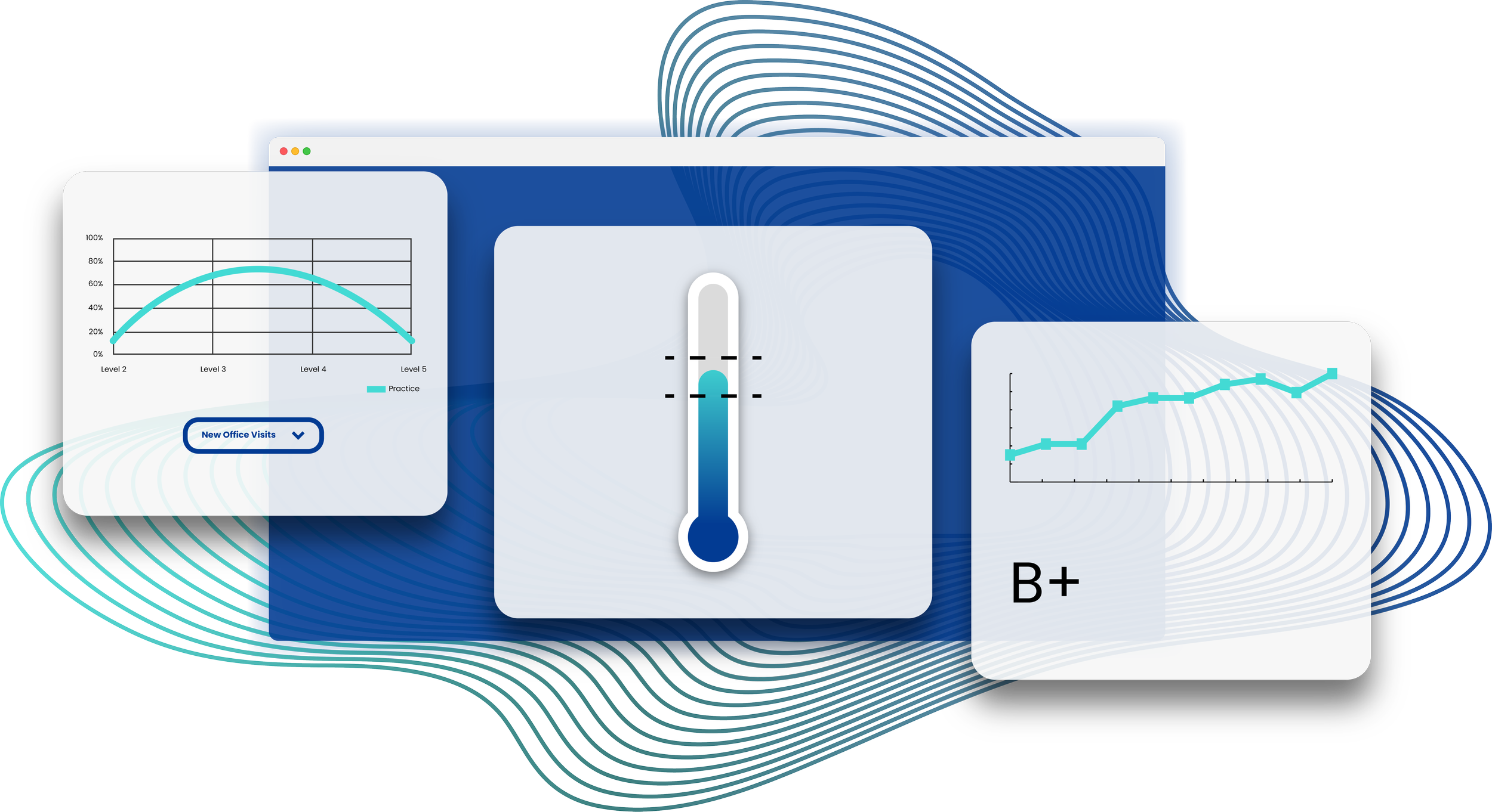
Line graph showing practice levels on a scale from Level 2 to Level 5, with the highest practice percentage at Level 3. Below the graph is a button labeled 'New Office Visits'.

Bell Curve

Compare your coding to industry standards to identify improvement areas for enhanced accuracy and revenue.

Thermometer indicating moderate temperature, with the mercury level around the middle.

Revenue Thermometer

Quickly assess your revenue cycle health to track your goals. Optimize coding, make real-time adjustments, and maintain strong revenue.

Discover Your Revenue Potential

Enter the number of charts per month below to get started.

Established Office Visits

Please enter a positive number.

New Office Visits

Please enter a positive number.
Projected Revenue Increase... $0
A digital dashboard with various charts, graphs, and data summaries related to revenue and performance metrics. Features include a thermometer gauge, line charts, a grade of B+, and data boxes showing revenue opportunities, breakdowns, and potential revenue.